Introduction to Python III#
In this notebook, we work through a typical data science exploratory analysis workflow:
Read in some data (using
pandas)Look at the raw data (
pandas)Compute some statistics (
pandas)Make some visualizations (
matplotlib,seaborn,plotly)
Introduction to Pandas#
So, what is Pandas?
Not this:

More like this:

But with code!

You may feel that removing the graphical interface from the spreadsheet is a step backwards. However, swapping buttons for code makes us much more efficient at complicated tasks (once we get used to it)
Loading the library#
# pandas is usually aliased as "pd"
import pandas as pd
Reading in data#
We will use the famous iris dataset.
# we can read in data from many formats. comma-separated values (csv) is a common one
# this csv is located at a url. It could just as easily be a file on your computer.
df = pd.read_csv("https://gist.githubusercontent.com/netj/8836201/raw/6f9306ad21398ea43cba4f7d537619d0e07d5ae3/iris.csv")

df
| sepal.length | sepal.width | petal.length | petal.width | variety | |
|---|---|---|---|---|---|
| 0 | 5.1 | 3.5 | 1.4 | 0.2 | Setosa |
| 1 | 4.9 | 3.0 | 1.4 | 0.2 | Setosa |
| 2 | 4.7 | 3.2 | 1.3 | 0.2 | Setosa |
| 3 | 4.6 | 3.1 | 1.5 | 0.2 | Setosa |
| 4 | 5.0 | 3.6 | 1.4 | 0.2 | Setosa |
| ... | ... | ... | ... | ... | ... |
| 145 | 6.7 | 3.0 | 5.2 | 2.3 | Virginica |
| 146 | 6.3 | 2.5 | 5.0 | 1.9 | Virginica |
| 147 | 6.5 | 3.0 | 5.2 | 2.0 | Virginica |
| 148 | 6.2 | 3.4 | 5.4 | 2.3 | Virginica |
| 149 | 5.9 | 3.0 | 5.1 | 1.8 | Virginica |
150 rows × 5 columns
When we read in the data, pandas creates a “dataframe” object. This is analogous to a spreadsheet in Excel.
type(df)
pandas.core.frame.DataFrame
No-one really knows the full extent of things you can do with a pandas dataframe (hyperbole).
You can browse the methods here: https://pandas.pydata.org/docs/reference/api/pandas.DataFrame.html
Basic attributes#
First, let’s consider a few simple attributes:
# the columns:
df.columns
Index(['sepal.length', 'sepal.width', 'petal.length', 'petal.width',
       'variety'],
      dtype='object')
# the first few rows:
df.head()
| sepal.length | sepal.width | petal.length | petal.width | variety | |
|---|---|---|---|---|---|
| 0 | 5.1 | 3.5 | 1.4 | 0.2 | Setosa |
| 1 | 4.9 | 3.0 | 1.4 | 0.2 | Setosa |
| 2 | 4.7 | 3.2 | 1.3 | 0.2 | Setosa |
| 3 | 4.6 | 3.1 | 1.5 | 0.2 | Setosa |
| 4 | 5.0 | 3.6 | 1.4 | 0.2 | Setosa |
# the shape of the dataframe:
df.shape  # number of rows, number of columns
(150, 5)
# the data types of the columns:
df.dtypes
sepal.length    float64
sepal.width     float64
petal.length    float64
petal.width     float64
variety          object
dtype: object
Selecting data#
# we can select a single column by name:
df['petal.width']
# an individial column is called a "series" in pandas
0      0.2
1      0.2
2      0.2
3      0.2
4      0.2
      ...
145    2.3
146    1.9
147    2.0
148    2.3
149    1.8
Name: petal.width, Length: 150, dtype: float64
# we can select multiple columns by name:
df[['petal.width', 'petal.length']]
| petal.width | petal.length | |
|---|---|---|
| 0 | 0.2 | 1.4 |
| 1 | 0.2 | 1.4 |
| 2 | 0.2 | 1.3 |
| 3 | 0.2 | 1.5 |
| 4 | 0.2 | 1.4 |
| ... | ... | ... |
| 145 | 2.3 | 5.2 |
| 146 | 1.9 | 5.0 |
| 147 | 2.0 | 5.2 |
| 148 | 2.3 | 5.4 |
| 149 | 1.8 | 5.1 |
150 rows × 2 columns
# we can select rows by index:
df.loc[0]
sepal.length       5.1
sepal.width        3.5
petal.length       1.4
petal.width        0.2
variety         Setosa
Name: 0, dtype: object
# we can select multiple rows by index:
df.loc[0:5]
# notice: the range is inclusive on both ends! why?
| sepal.length | sepal.width | petal.length | petal.width | variety | |
|---|---|---|---|---|---|
| 0 | 5.1 | 3.5 | 1.4 | 0.2 | Setosa |
| 1 | 4.9 | 3.0 | 1.4 | 0.2 | Setosa |
| 2 | 4.7 | 3.2 | 1.3 | 0.2 | Setosa |
| 3 | 4.6 | 3.1 | 1.5 | 0.2 | Setosa |
| 4 | 5.0 | 3.6 | 1.4 | 0.2 | Setosa |
| 5 | 5.4 | 3.9 | 1.7 | 0.4 | Setosa |
# we can select specific elements by row and column:
df.loc[0, 'petal.width']
0.2
# we can select a range of elements by row and column ranges:
df.loc[0:5, 'petal.width':'variety']
| petal.width | variety | |
|---|---|---|
| 0 | 0.2 | Setosa |
| 1 | 0.2 | Setosa |
| 2 | 0.2 | Setosa |
| 3 | 0.2 | Setosa |
| 4 | 0.2 | Setosa |
| 5 | 0.4 | Setosa |
Basic math manipulations#
# we can take the average of a column
df['petal.length'].mean()

# there are lots of other options we can perform, for example: min, max, median, mode, std, var, sum, count, etc.
3.7580000000000027
# what if we wanted to know the average of sepal.length and sepal.width for each sample?
df[['sepal.length', 'sepal.width']].mean(axis=1)

# here we use "axis=1" to specify that we are taking the average along the row rather than down the column.
0      4.30
1      3.95
2      3.95
3      3.85
4      4.30
       ...
145    4.85
146    4.40
147    4.75
148    4.80
149    4.45
Length: 150, dtype: float64
# let's store this as a new column
df['sepal.mean'] = df[['sepal.length', 'sepal.width']].mean(axis=1)

df
| sepal.length | sepal.width | petal.length | petal.width | variety | sepal.mean | |
|---|---|---|---|---|---|---|
| 0 | 5.1 | 3.5 | 1.4 | 0.2 | Setosa | 4.30 |
| 1 | 4.9 | 3.0 | 1.4 | 0.2 | Setosa | 3.95 |
| 2 | 4.7 | 3.2 | 1.3 | 0.2 | Setosa | 3.95 |
| 3 | 4.6 | 3.1 | 1.5 | 0.2 | Setosa | 3.85 |
| 4 | 5.0 | 3.6 | 1.4 | 0.2 | Setosa | 4.30 |
| ... | ... | ... | ... | ... | ... | ... |
| 145 | 6.7 | 3.0 | 5.2 | 2.3 | Virginica | 4.85 |
| 146 | 6.3 | 2.5 | 5.0 | 1.9 | Virginica | 4.40 |
| 147 | 6.5 | 3.0 | 5.2 | 2.0 | Virginica | 4.75 |
| 148 | 6.2 | 3.4 | 5.4 | 2.3 | Virginica | 4.80 |
| 149 | 5.9 | 3.0 | 5.1 | 1.8 | Virginica | 4.45 |
150 rows × 6 columns
# we could also have computed the mean by directly manipulating the columns:
df['sepal.mean.2'] = (df['sepal.length'] + df['sepal.width']) / 2

df
| sepal.length | sepal.width | petal.length | petal.width | variety | sepal.mean | sepal.mean.2 | |
|---|---|---|---|---|---|---|---|
| 0 | 5.1 | 3.5 | 1.4 | 0.2 | Setosa | 4.30 | 4.30 |
| 1 | 4.9 | 3.0 | 1.4 | 0.2 | Setosa | 3.95 | 3.95 |
| 2 | 4.7 | 3.2 | 1.3 | 0.2 | Setosa | 3.95 | 3.95 |
| 3 | 4.6 | 3.1 | 1.5 | 0.2 | Setosa | 3.85 | 3.85 |
| 4 | 5.0 | 3.6 | 1.4 | 0.2 | Setosa | 4.30 | 4.30 |
| ... | ... | ... | ... | ... | ... | ... | ... |
| 145 | 6.7 | 3.0 | 5.2 | 2.3 | Virginica | 4.85 | 4.85 |
| 146 | 6.3 | 2.5 | 5.0 | 1.9 | Virginica | 4.40 | 4.40 |
| 147 | 6.5 | 3.0 | 5.2 | 2.0 | Virginica | 4.75 | 4.75 |
| 148 | 6.2 | 3.4 | 5.4 | 2.3 | Virginica | 4.80 | 4.80 |
| 149 | 5.9 | 3.0 | 5.1 | 1.8 | Virginica | 4.45 | 4.45 |
150 rows × 7 columns
Save to a file#
# we can write the modified dataframne to a new csv file
df.to_csv('iris_with_means.csv')
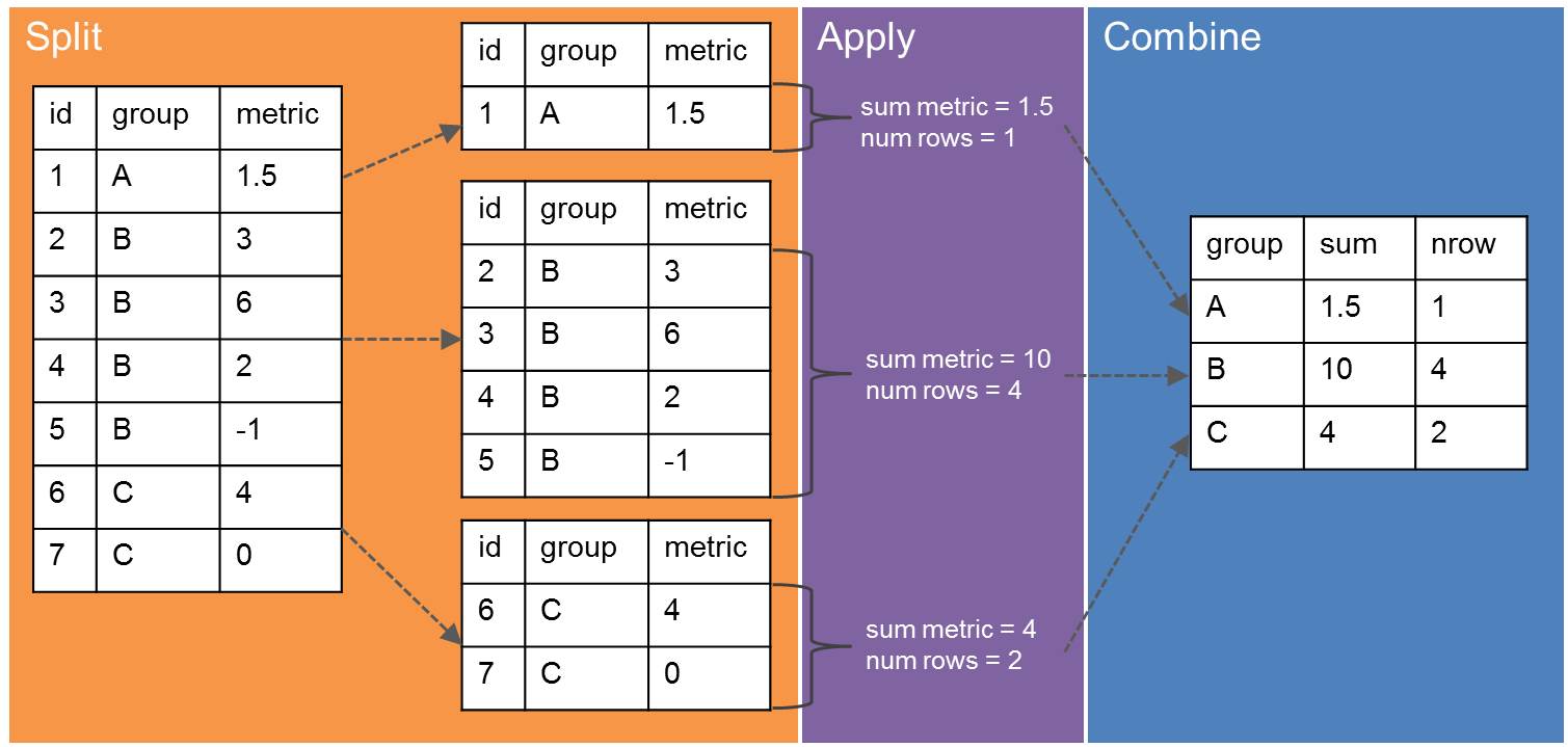
Powerful data manipulation with “Split, Apply, Combine”#
“Split, Apply, Combine” refers to the common practice of splitting up a dataset into relevant chunks, doing some computation on those chunks, then combining the output into a single table. In pandas, we can break up the data into groups using the groupby method. We can then apply our computation on the grouped data. If we set things up right, pandas will combine the results automatically. Image credit.
# load the original iris dataset file
df = pd.read_csv("https://gist.githubusercontent.com/netj/8836201/raw/6f9306ad21398ea43cba4f7d537619d0e07d5ae3/iris.csv")
df
| sepal.length | sepal.width | petal.length | petal.width | variety | |
|---|---|---|---|---|---|
| 0 | 5.1 | 3.5 | 1.4 | 0.2 | Setosa |
| 1 | 4.9 | 3.0 | 1.4 | 0.2 | Setosa |
| 2 | 4.7 | 3.2 | 1.3 | 0.2 | Setosa |
| 3 | 4.6 | 3.1 | 1.5 | 0.2 | Setosa |
| 4 | 5.0 | 3.6 | 1.4 | 0.2 | Setosa |
| ... | ... | ... | ... | ... | ... |
| 145 | 6.7 | 3.0 | 5.2 | 2.3 | Virginica |
| 146 | 6.3 | 2.5 | 5.0 | 1.9 | Virginica |
| 147 | 6.5 | 3.0 | 5.2 | 2.0 | Virginica |
| 148 | 6.2 | 3.4 | 5.4 | 2.3 | Virginica |
| 149 | 5.9 | 3.0 | 5.1 | 1.8 | Virginica |
150 rows × 5 columns
groupby#
Group by allows us to split up the data.
# what do we get just call groupby?
df.groupby('variety')
# answer: a special DataFrameGroupBy object
<pandas.core.groupby.generic.DataFrameGroupBy object at 0x149145353b80>
# we can iterate over this data structure manually:
for g, d in df.groupby('variety'):
    print(g)
    display(d.head(2))
Setosa
| sepal.length | sepal.width | petal.length | petal.width | variety | |
|---|---|---|---|---|---|
| 0 | 5.1 | 3.5 | 1.4 | 0.2 | Setosa |
| 1 | 4.9 | 3.0 | 1.4 | 0.2 | Setosa |
Versicolor
| sepal.length | sepal.width | petal.length | petal.width | variety | |
|---|---|---|---|---|---|
| 50 | 7.0 | 3.2 | 4.7 | 1.4 | Versicolor |
| 51 | 6.4 | 3.2 | 4.5 | 1.5 | Versicolor |
Virginica
| sepal.length | sepal.width | petal.length | petal.width | variety | |
|---|---|---|---|---|---|
| 100 | 6.3 | 3.3 | 6.0 | 2.5 | Virginica |
| 101 | 5.8 | 2.7 | 5.1 | 1.9 | Virginica |
# we can even perform split-apply-combine manually
# for instance, we can compute the average 'sepal.length' for each set

variety = []
sepal_length = []

# 1. Split
for g, d in df.groupby('variety'):
    variety.append(g)
    # 2. Apply:
    sepal_length.append(d['sepal.length'].mean())

# 3. Combine
pd.DataFrame({'variety': variety, 'sepal.length': sepal_length})
| variety | sepal.length | |
|---|---|---|
| 0 | Setosa | 5.006 |
| 1 | Versicolor | 5.936 |
| 2 | Virginica | 6.588 |
# but this is such a common workflow that pandas makes it easy
df.groupby('variety', as_index=False)['sepal.length'].mean()
| variety | sepal.length | |
|---|---|---|
| 0 | Setosa | 5.006 |
| 1 | Versicolor | 5.936 |
| 2 | Virginica | 6.588 |
# and, using the pandas way, we can compute the mean of all variables without writing more code
df.groupby('variety', as_index=False).mean()
| variety | sepal.length | sepal.width | petal.length | petal.width | |
|---|---|---|---|---|---|
| 0 | Setosa | 5.006 | 3.428 | 1.462 | 0.246 |
| 1 | Versicolor | 5.936 | 2.770 | 4.260 | 1.326 |
| 2 | Virginica | 6.588 | 2.974 | 5.552 | 2.026 |
# we can even compute multiple metrics per column using the `agg` method:
df.groupby('variety', as_index=False).agg(['mean', 'std', 'sem', 'count'])
# advanced note: because we have multiple functions for each variable, pandas has created a multi-index for the columns
| sepal.length | sepal.width | petal.length | petal.width | |||||||||||||
|---|---|---|---|---|---|---|---|---|---|---|---|---|---|---|---|---|
| mean | std | sem | count | mean | std | sem | count | mean | std | sem | count | mean | std | sem | count | |
| variety | ||||||||||||||||
| Setosa | 5.006 | 0.352490 | 0.049850 | 50 | 3.428 | 0.379064 | 0.053608 | 50 | 1.462 | 0.173664 | 0.024560 | 50 | 0.246 | 0.105386 | 0.014904 | 50 |
| Versicolor | 5.936 | 0.516171 | 0.072998 | 50 | 2.770 | 0.313798 | 0.044378 | 50 | 4.260 | 0.469911 | 0.066455 | 50 | 1.326 | 0.197753 | 0.027966 | 50 |
| Virginica | 6.588 | 0.635880 | 0.089927 | 50 | 2.974 | 0.322497 | 0.045608 | 50 | 5.552 | 0.551895 | 0.078050 | 50 | 2.026 | 0.274650 | 0.038841 | 50 |
# pretty colors if you want
df.groupby('variety').agg(['mean', 'std', 'sem', 'count']).style.background_gradient('Blues')
| sepal.length | sepal.width | petal.length | petal.width | |||||||||||||
|---|---|---|---|---|---|---|---|---|---|---|---|---|---|---|---|---|
| mean | std | sem | count | mean | std | sem | count | mean | std | sem | count | mean | std | sem | count | |
| variety | ||||||||||||||||
| Setosa | 5.006000 | 0.352490 | 0.049850 | 50 | 3.428000 | 0.379064 | 0.053608 | 50 | 1.462000 | 0.173664 | 0.024560 | 50 | 0.246000 | 0.105386 | 0.014904 | 50 |
| Versicolor | 5.936000 | 0.516171 | 0.072998 | 50 | 2.770000 | 0.313798 | 0.044378 | 50 | 4.260000 | 0.469911 | 0.066455 | 50 | 1.326000 | 0.197753 | 0.027966 | 50 |
| Virginica | 6.588000 | 0.635880 | 0.089927 | 50 | 2.974000 | 0.322497 | 0.045608 | 50 | 5.552000 | 0.551895 | 0.078050 | 50 | 2.026000 | 0.274650 | 0.038841 | 50 |
apply#
The above methods worked because pandas implements special “mean”, “std”, “sem”, and “count” for the grouped data frame object. But what if we want to apply some custom function to the grouped data?
For example, say we wanted to apply standard-normal scaling to the sepal.length variable within each
variety group? If \(x\) is sepal.length, we want to compute a new variable
$\(
x' = \frac{x - \mu_x}{\sigma_x}
\)\(
where \)\mu_x\( and \)\sigma_x$ are computed separately within each variety.
How do we do this in pandas? This is where the apply method comes in. See the documentation for more tricks.
# first define a function that applies to a specific element
def standard_scaler(data):
    """Standardize the data"""
    return (data - data.mean()) / data.std()

# then use apply to loop the function over the column
df_scaled = df.set_index('variety').groupby('variety', group_keys=False).apply(standard_scaler)
df_scaled
| sepal.length | sepal.width | petal.length | petal.width | |
|---|---|---|---|---|
| variety | ||||
| Setosa | 0.266674 | 0.189941 | -0.357011 | -0.436492 |
| Setosa | -0.300718 | -1.129096 | -0.357011 | -0.436492 |
| Setosa | -0.868111 | -0.601481 | -0.932836 | -0.436492 |
| Setosa | -1.151807 | -0.865288 | 0.218813 | -0.436492 |
| Setosa | -0.017022 | 0.453749 | -0.357011 | -0.436492 |
| ... | ... | ... | ... | ... |
| Virginica | 0.176134 | 0.080621 | -0.637803 | 0.997633 |
| Virginica | -0.452916 | -1.469783 | -1.000191 | -0.458766 |
| Virginica | -0.138391 | 0.080621 | -0.637803 | -0.094666 |
| Virginica | -0.610178 | 1.320944 | -0.275415 | 0.997633 |
| Virginica | -1.081966 | 0.080621 | -0.818997 | -0.822865 |
150 rows × 4 columns
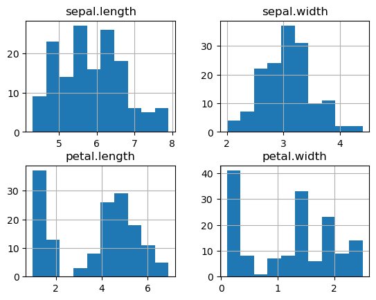
print("Original variables:")
_ = df.set_index('variety').hist()
Original variables:
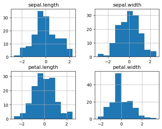
print("Scaled variables:")
_ = df_scaled.hist()
Scaled variables:
melt and pivot_table#
Often our data contains multiple measurements, with each measurement using one column. Sometimes, it is more convenient to place all of the measurements in a single column, with an additional column to indicate which measurement the value represents.
Take for example the iris dataset.
Original:
df.head()
| sepal.length | sepal.width | petal.length | petal.width | variety | |
|---|---|---|---|---|---|
| 0 | 5.1 | 3.5 | 1.4 | 0.2 | Setosa |
| 1 | 4.9 | 3.0 | 1.4 | 0.2 | Setosa |
| 2 | 4.7 | 3.2 | 1.3 | 0.2 | Setosa |
| 3 | 4.6 | 3.1 | 1.5 | 0.2 | Setosa |
| 4 | 5.0 | 3.6 | 1.4 | 0.2 | Setosa |
Melted version:
df.melt(id_vars = ['variety'])
| variety | variable | value | |
|---|---|---|---|
| 0 | Setosa | sepal.length | 5.1 |
| 1 | Setosa | sepal.length | 4.9 |
| 2 | Setosa | sepal.length | 4.7 |
| 3 | Setosa | sepal.length | 4.6 |
| 4 | Setosa | sepal.length | 5.0 |
| ... | ... | ... | ... |
| 595 | Virginica | petal.width | 2.3 |
| 596 | Virginica | petal.width | 1.9 |
| 597 | Virginica | petal.width | 2.0 |
| 598 | Virginica | petal.width | 2.3 |
| 599 | Virginica | petal.width | 1.8 |
600 rows × 3 columns
Notice that this results in a narrower and longer dataframe. By default, pandas assigns the names variable and value to the column giving the measurement name and the column holding the measurement itself, respectively. We can change these by passing in the right arguments:
df.melt(id_vars = ['variety'], var_name='measurement_name', value_name='measurement_value')
| variety | measurement_name | measurement_value | |
|---|---|---|---|
| 0 | Setosa | sepal.length | 5.1 |
| 1 | Setosa | sepal.length | 4.9 |
| 2 | Setosa | sepal.length | 4.7 |
| 3 | Setosa | sepal.length | 4.6 |
| 4 | Setosa | sepal.length | 5.0 |
| ... | ... | ... | ... |
| 595 | Virginica | petal.width | 2.3 |
| 596 | Virginica | petal.width | 1.9 |
| 597 | Virginica | petal.width | 2.0 |
| 598 | Virginica | petal.width | 2.3 |
| 599 | Virginica | petal.width | 1.8 |
600 rows × 3 columns
Question: Why would we want to melt a dataframe?
df_melted = df.melt(id_vars = ['variety'])

df_melted.head()
| variety | variable | value | |
|---|---|---|---|
| 0 | Setosa | sepal.length | 5.1 |
| 1 | Setosa | sepal.length | 4.9 |
| 2 | Setosa | sepal.length | 4.7 |
| 3 | Setosa | sepal.length | 4.6 |
| 4 | Setosa | sepal.length | 5.0 |
df_melted.groupby(['variety', 'variable']).agg(['mean', 'sem'])
| value | |||
|---|---|---|---|
| mean | sem | ||
| variety | variable | ||
| Setosa | petal.length | 1.462 | 0.024560 |
| petal.width | 0.246 | 0.014904 | |
| sepal.length | 5.006 | 0.049850 | |
| sepal.width | 3.428 | 0.053608 | |
| Versicolor | petal.length | 4.260 | 0.066455 |
| petal.width | 1.326 | 0.027966 | |
| sepal.length | 5.936 | 0.072998 | |
| sepal.width | 2.770 | 0.044378 | |
| Virginica | petal.length | 5.552 | 0.078050 |
| petal.width | 2.026 | 0.038841 | |
| sepal.length | 6.588 | 0.089927 | |
| sepal.width | 2.974 | 0.045608 | |
Compare this with the same operation on the original data
df.groupby(['variety']).agg(['mean', 'sem'])
| sepal.length | sepal.width | petal.length | petal.width | |||||
|---|---|---|---|---|---|---|---|---|
| mean | sem | mean | sem | mean | sem | mean | sem | |
| variety | ||||||||
| Setosa | 5.006 | 0.049850 | 3.428 | 0.053608 | 1.462 | 0.024560 | 0.246 | 0.014904 |
| Versicolor | 5.936 | 0.072998 | 2.770 | 0.044378 | 4.260 | 0.066455 | 1.326 | 0.027966 |
| Virginica | 6.588 | 0.089927 | 2.974 | 0.045608 | 5.552 | 0.078050 | 2.026 | 0.038841 |
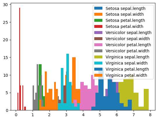
# with the melted data, we can easily plot the distribution of each variable for each variety
import matplotlib.pyplot as plt

for key, group in df_melted.groupby(['variety', 'variable']):
    plt.hist(group['value'], label=" ".join(key))
_ = plt.legend()
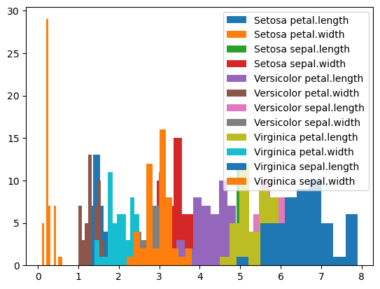
Compare with how we have to produce this plot from the original dataframe:
# with the original dataframe, we need a second for loop over the different columns we want to plot
for key, group in df.groupby('variety'):
    for col in ["sepal.length", "sepal.width", "petal.length", "petal.width"]:
        plt.hist(group[col], label=f"{key} {col}")
_ = plt.legend()
pivot_table is the conceptually the opposite of melt. It allows us to convert a column with variable names into multiple columns.
Let’s use pivot table on our melted dataframe. To do so, we need to specify the following:
index: which columns will be used to uniquely specify the rows in the resulting dataframe. In this case, we wantvariety.columns: which columns will be converted into new columns in the resulting dataframe. In this case, we wantvariable.values: which column contains the values that will be used to populate the new dataframe. In this case, we wantvalue.
df_melted.pivot_table(index = 'variety', columns='variable', values='value')
| variable | petal.length | petal.width | sepal.length | sepal.width |
|---|---|---|---|---|
| variety | ||||
| Setosa | 1.462 | 0.246 | 5.006 | 3.428 |
| Versicolor | 4.260 | 1.326 | 5.936 | 2.770 |
| Virginica | 5.552 | 2.026 | 6.588 | 2.974 |
Notice that we only have 3 rows! This is because the provided index (variety) does not uniquely specify the original rows in our dataframe. When pivoting, pandas applied the default aggregation function – mean – to fill the cells.
We can change the aggregation function as needed:
df_melted.pivot_table(index = 'variety', columns='variable', values='value', aggfunc='max')
| variable | petal.length | petal.width | sepal.length | sepal.width |
|---|---|---|---|---|
| variety | ||||
| Setosa | 1.9 | 0.6 | 5.8 | 4.4 |
| Versicolor | 5.1 | 1.8 | 7.0 | 3.4 |
| Virginica | 6.9 | 2.5 | 7.9 | 3.8 |
# here we provide a custom lambda aggfunc. This shows how pivot_table
# can be used to make nice human-readable tables
df_melted.pivot_table(index = 'variety', columns='variable', values='value', aggfunc=lambda x: f"{x.mean():0.2f}+/-{1.96*x.sem():0.2f}")
| variable | petal.length | petal.width | sepal.length | sepal.width |
|---|---|---|---|---|
| variety | ||||
| Setosa | 1.46+/-0.05 | 0.25+/-0.03 | 5.01+/-0.10 | 3.43+/-0.11 |
| Versicolor | 4.26+/-0.13 | 1.33+/-0.05 | 5.94+/-0.14 | 2.77+/-0.09 |
| Virginica | 5.55+/-0.15 | 2.03+/-0.08 | 6.59+/-0.18 | 2.97+/-0.09 |
Understanding your data with distribution plots#
The “taxis” dataset#
# seaborn is a popular plotting library that works well with pandas
import seaborn as sns
df = sns.load_dataset('taxis')
df
| pickup | dropoff | passengers | distance | fare | tip | tolls | total | color | payment | pickup_zone | dropoff_zone | pickup_borough | dropoff_borough | |
|---|---|---|---|---|---|---|---|---|---|---|---|---|---|---|
| 0 | 2019-03-23 20:21:09 | 2019-03-23 20:27:24 | 1 | 1.60 | 7.0 | 2.15 | 0.0 | 12.95 | yellow | credit card | Lenox Hill West | UN/Turtle Bay South | Manhattan | Manhattan |
| 1 | 2019-03-04 16:11:55 | 2019-03-04 16:19:00 | 1 | 0.79 | 5.0 | 0.00 | 0.0 | 9.30 | yellow | cash | Upper West Side South | Upper West Side South | Manhattan | Manhattan |
| 2 | 2019-03-27 17:53:01 | 2019-03-27 18:00:25 | 1 | 1.37 | 7.5 | 2.36 | 0.0 | 14.16 | yellow | credit card | Alphabet City | West Village | Manhattan | Manhattan |
| 3 | 2019-03-10 01:23:59 | 2019-03-10 01:49:51 | 1 | 7.70 | 27.0 | 6.15 | 0.0 | 36.95 | yellow | credit card | Hudson Sq | Yorkville West | Manhattan | Manhattan |
| 4 | 2019-03-30 13:27:42 | 2019-03-30 13:37:14 | 3 | 2.16 | 9.0 | 1.10 | 0.0 | 13.40 | yellow | credit card | Midtown East | Yorkville West | Manhattan | Manhattan |
| ... | ... | ... | ... | ... | ... | ... | ... | ... | ... | ... | ... | ... | ... | ... |
| 6428 | 2019-03-31 09:51:53 | 2019-03-31 09:55:27 | 1 | 0.75 | 4.5 | 1.06 | 0.0 | 6.36 | green | credit card | East Harlem North | Central Harlem North | Manhattan | Manhattan |
| 6429 | 2019-03-31 17:38:00 | 2019-03-31 18:34:23 | 1 | 18.74 | 58.0 | 0.00 | 0.0 | 58.80 | green | credit card | Jamaica | East Concourse/Concourse Village | Queens | Bronx |
| 6430 | 2019-03-23 22:55:18 | 2019-03-23 23:14:25 | 1 | 4.14 | 16.0 | 0.00 | 0.0 | 17.30 | green | cash | Crown Heights North | Bushwick North | Brooklyn | Brooklyn |
| 6431 | 2019-03-04 10:09:25 | 2019-03-04 10:14:29 | 1 | 1.12 | 6.0 | 0.00 | 0.0 | 6.80 | green | credit card | East New York | East Flatbush/Remsen Village | Brooklyn | Brooklyn |
| 6432 | 2019-03-13 19:31:22 | 2019-03-13 19:48:02 | 1 | 3.85 | 15.0 | 3.36 | 0.0 | 20.16 | green | credit card | Boerum Hill | Windsor Terrace | Brooklyn | Brooklyn |
6433 rows × 14 columns
Questions we might want to answer based on this data:
How does the fare depend on other factors like travel distance, number of passengers, time of day, and pickup zone?
What are the most common pickup and dropoff locations in the data?
What factors influence the travel time?
Do green cabs charge bigger fares than yellow cabs?
Can you think of any other questions?
Distribution plots / density plots can help us start to answer these questions.
Histogram for 1D data#
_ = plt.hist(df.fare)
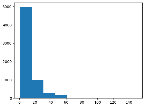
Problems:
No labels
Not enough bins
Let’s improve this histogram
plt.hist(df.fare, bins=100)
plt.xlabel('Fare')
plt.ylabel('Count')
Text(0, 0.5, 'Count')
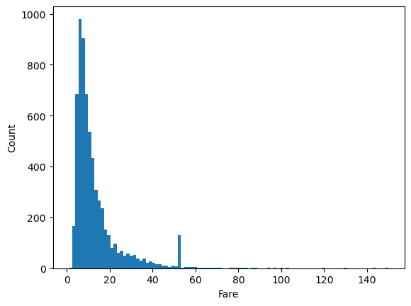
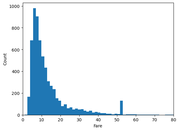
That’s much better, but there’s a lot of wasted space due to some very high Fare values. Let’s manually set the limit to get rid of this.
plt.hist(df.fare, bins=100)
plt.xlabel('Fare')
plt.ylabel('Count')
plt.xlim(0,80)
(0.0, 80.0)
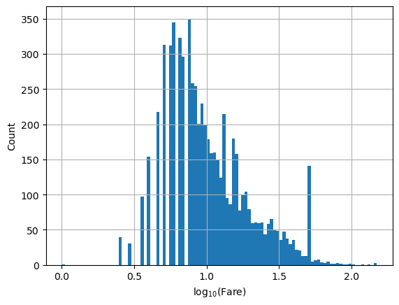
Given the nature of the distribution, we may wish to put the x-axis on a log scale.
# we need the numpy library to take the log of the fare
import numpy as np

# we can do this by taking the log of the fare, in which case the bins are uniform in log space...
plt.hist(np.log10(df.fare), bins=100)
plt.xlabel(r'$\log_{10}(\mathrm{Fare})$')
plt.ylabel('Count')
plt.grid()
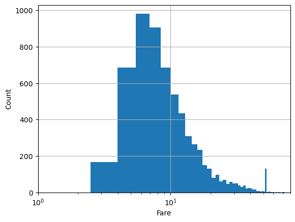
# or by converting the axis to log-scale after the fact. In this case, bins are non-uniform
# in log space.
plt.hist(df.fare, bins=100)
plt.xlabel('Fare')
plt.ylabel('Count')
plt.xlim(1,80)
plt.semilogx()
plt.grid()
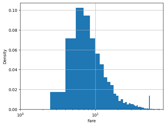
By default, hist gives number of samples for the y axis. Sometimes, we want the percentage of samples in the bin instead.
plt.hist(df.fare, bins=100, density=True)
plt.xlabel('Fare')
plt.ylabel('Density')
plt.xlim(1,80)
plt.semilogx()
plt.grid()
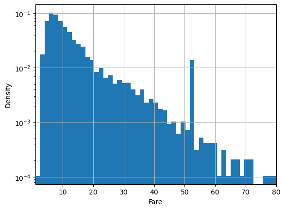
Sometimes we want the log-density instead:
plt.hist(df.fare, bins=100, density=True, log=True)
plt.xlabel('Fare')
plt.ylabel('Density')
plt.xlim(1,80)
plt.grid()
Kernel Density Estimation#
Sometimes we want smooth approximations to our data distribution. Smooth approximations can show us the underlying pattern while removing noise due to small sample size. Kernel Density Estimation is just a fancy name for a method of fitting smooth approximations to data distributions. The seaborn library, which we loaded with alias sns provides convenient methods for fitting and plotting kernel density estimates.
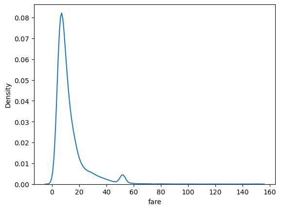
sns.kdeplot(data=df, x='fare')
<AxesSubplot:xlabel='fare', ylabel='Density'>
Seaborn functions like kdeplot have about a jillion arguments
sns.kdeplot?
Signature:
sns.kdeplot(
    x=None,
    *,
    y=None,
    shade=None,
    vertical=False,
    kernel=None,
    bw=None,
    gridsize=200,
    cut=3,
    clip=None,
    legend=True,
    cumulative=False,
    shade_lowest=None,
    cbar=False,
    cbar_ax=None,
    cbar_kws=None,
    ax=None,
    weights=None,
    hue=None,
    palette=None,
    hue_order=None,
    hue_norm=None,
    multiple='layer',
    common_norm=True,
    common_grid=False,
    levels=10,
    thresh=0.05,
    bw_method='scott',
    bw_adjust=1,
    log_scale=None,
    color=None,
    fill=None,
    data=None,
    data2=None,
    warn_singular=True,
    **kwargs,
)
Docstring:
Plot univariate or bivariate distributions using kernel density estimation.

A kernel density estimate (KDE) plot is a method for visualizing the
distribution of observations in a dataset, analagous to a histogram. KDE
represents the data using a continuous probability density curve in one or
more dimensions.

The approach is explained further in the :ref:`user guide <tutorial_kde>`.

Relative to a histogram, KDE can produce a plot that is less cluttered and
more interpretable, especially when drawing multiple distributions. But it
has the potential to introduce distortions if the underlying distribution is
bounded or not smooth. Like a histogram, the quality of the representation
also depends on the selection of good smoothing parameters.

Parameters
----------
x, y : vectors or keys in ``data``
    Variables that specify positions on the x and y axes.
shade : bool
    Alias for ``fill``. Using ``fill`` is recommended.
vertical : bool
    Orientation parameter.

    .. deprecated:: 0.11.0
       specify orientation by assigning the ``x`` or ``y`` variables.

kernel : str
    Function that defines the kernel.

    .. deprecated:: 0.11.0
       support for non-Gaussian kernels has been removed.

bw : str, number, or callable
    Smoothing parameter.

    .. deprecated:: 0.11.0
       see ``bw_method`` and ``bw_adjust``.

gridsize : int
    Number of points on each dimension of the evaluation grid.
cut : number, optional
    Factor, multiplied by the smoothing bandwidth, that determines how
    far the evaluation grid extends past the extreme datapoints. When
    set to 0, truncate the curve at the data limits.
clip : pair of numbers or None, or a pair of such pairs
    Do not evaluate the density outside of these limits.
legend : bool
    If False, suppress the legend for semantic variables.
cumulative : bool, optional
    If True, estimate a cumulative distribution function.
shade_lowest : bool
    If False, the area below the lowest contour will be transparent

    .. deprecated:: 0.11.0
       see ``thresh``.

cbar : bool
    If True, add a colorbar to annotate the color mapping in a bivariate plot.
    Note: Does not currently support plots with a ``hue`` variable well.
cbar_ax : :class:`matplotlib.axes.Axes`
    Pre-existing axes for the colorbar.
cbar_kws : dict
    Additional parameters passed to :meth:`matplotlib.figure.Figure.colorbar`.
ax : :class:`matplotlib.axes.Axes`
    Pre-existing axes for the plot. Otherwise, call :func:`matplotlib.pyplot.gca`
    internally.
weights : vector or key in ``data``
    If provided, weight the kernel density estimation using these values.
hue : vector or key in ``data``
    Semantic variable that is mapped to determine the color of plot elements.
palette : string, list, dict, or :class:`matplotlib.colors.Colormap`
    Method for choosing the colors to use when mapping the ``hue`` semantic.
    String values are passed to :func:`color_palette`. List or dict values
    imply categorical mapping, while a colormap object implies numeric mapping.
hue_order : vector of strings
    Specify the order of processing and plotting for categorical levels of the
    ``hue`` semantic.
hue_norm : tuple or :class:`matplotlib.colors.Normalize`
    Either a pair of values that set the normalization range in data units
    or an object that will map from data units into a [0, 1] interval. Usage
    implies numeric mapping.
multiple : {{"layer", "stack", "fill"}}
    Method for drawing multiple elements when semantic mapping creates subsets.
    Only relevant with univariate data.
common_norm : bool
    If True, scale each conditional density by the number of observations
    such that the total area under all densities sums to 1. Otherwise,
    normalize each density independently.
common_grid : bool
    If True, use the same evaluation grid for each kernel density estimate.
    Only relevant with univariate data.
levels : int or vector
    Number of contour levels or values to draw contours at. A vector argument
    must have increasing values in [0, 1]. Levels correspond to iso-proportions
    of the density: e.g., 20% of the probability mass will lie below the
    contour drawn for 0.2. Only relevant with bivariate data.
thresh : number in [0, 1]
    Lowest iso-proportion level at which to draw a contour line. Ignored when
    ``levels`` is a vector. Only relevant with bivariate data.
bw_method : string, scalar, or callable, optional
    Method for determining the smoothing bandwidth to use; passed to
    :class:`scipy.stats.gaussian_kde`.
bw_adjust : number, optional
    Factor that multiplicatively scales the value chosen using
    ``bw_method``. Increasing will make the curve smoother. See Notes.
log_scale : bool or number, or pair of bools or numbers
    Set axis scale(s) to log. A single value sets the data axis for univariate
    distributions and both axes for bivariate distributions. A pair of values
    sets each axis independently. Numeric values are interpreted as the desired
    base (default 10). If `False`, defer to the existing Axes scale.
color : :mod:`matplotlib color <matplotlib.colors>`
    Single color specification for when hue mapping is not used. Otherwise, the
    plot will try to hook into the matplotlib property cycle.
fill : bool or None
    If True, fill in the area under univariate density curves or between
    bivariate contours. If None, the default depends on ``multiple``.
data : :class:`pandas.DataFrame`, :class:`numpy.ndarray`, mapping, or sequence
    Input data structure. Either a long-form collection of vectors that can be
    assigned to named variables or a wide-form dataset that will be internally
    reshaped.
warn_singular : bool
    If True, issue a warning when trying to estimate the density of data
    with zero variance.
kwargs
    Other keyword arguments are passed to one of the following matplotlib
    functions:

    - :meth:`matplotlib.axes.Axes.plot` (univariate, ``fill=False``),
    - :meth:`matplotlib.axes.Axes.fill_between` (univariate, ``fill=True``),
    - :meth:`matplotlib.axes.Axes.contour` (bivariate, ``fill=False``),
    - :meth:`matplotlib.axes.contourf` (bivariate, ``fill=True``).

Returns
-------
:class:`matplotlib.axes.Axes`
    The matplotlib axes containing the plot.

See Also
--------
displot : Figure-level interface to distribution plot functions.
histplot : Plot a histogram of binned counts with optional normalization or smoothing.
ecdfplot : Plot empirical cumulative distribution functions.
jointplot : Draw a bivariate plot with univariate marginal distributions.
violinplot : Draw an enhanced boxplot using kernel density estimation.

Notes
-----

The *bandwidth*, or standard deviation of the smoothing kernel, is an
important parameter. Misspecification of the bandwidth can produce a
distorted representation of the data. Much like the choice of bin width in a
histogram, an over-smoothed curve can erase true features of a
distribution, while an under-smoothed curve can create false features out of
random variability. The rule-of-thumb that sets the default bandwidth works
best when the true distribution is smooth, unimodal, and roughly bell-shaped.
It is always a good idea to check the default behavior by using ``bw_adjust``
to increase or decrease the amount of smoothing.

Because the smoothing algorithm uses a Gaussian kernel, the estimated density
curve can extend to values that do not make sense for a particular dataset.
For example, the curve may be drawn over negative values when smoothing data
that are naturally positive. The ``cut`` and ``clip`` parameters can be used
to control the extent of the curve, but datasets that have many observations
close to a natural boundary may be better served by a different visualization
method.

Similar considerations apply when a dataset is naturally discrete or "spiky"
(containing many repeated observations of the same value). Kernel density
estimation will always produce a smooth curve, which would be misleading
in these situations.

The units on the density axis are a common source of confusion. While kernel
density estimation produces a probability distribution, the height of the curve
at each point gives a density, not a probability. A probability can be obtained
only by integrating the density across a range. The curve is normalized so
that the integral over all possible values is 1, meaning that the scale of
the density axis depends on the data values.

Examples
--------

.. include:: ../docstrings/kdeplot.rst
File:      /software/spackages/linux-rocky8-x86_64/gcc-9.5.0/anaconda3-2022.10-dtqfczcbv33ugxmsznhll4vjexdcxjfn/lib/python3.9/site-packages/seaborn/distributions.py
Type:      function
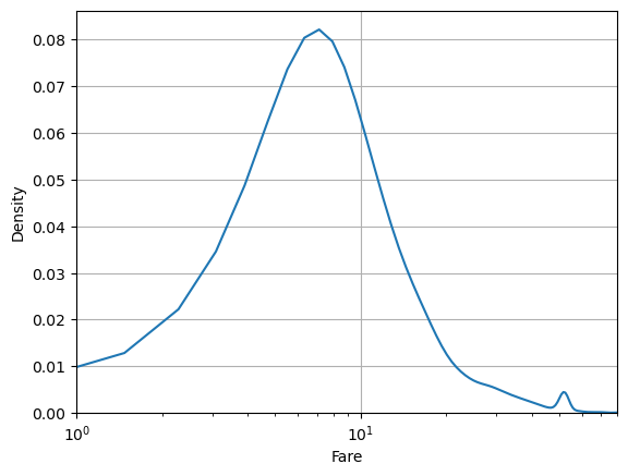
But seaborn uses matplotlib under the hood. So we can use some matplotlib commands to customize the look.
sns.kdeplot(data=df, x='fare')
plt.xlabel('Fare')
plt.xlim(1,80)
plt.semilogx()
plt.grid()
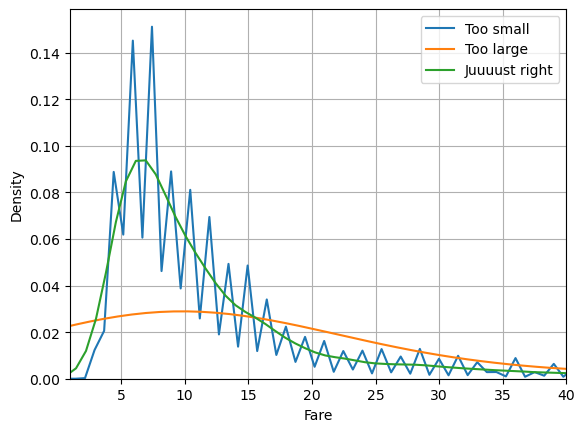
In KDE, it’s important to correctly set the smoothness parameter called bw_method for bin width method. Too large and you remove important structure in your data. Too small and you are fitting the noise.
sns.kdeplot(data=df, x='fare', bw_method=0.01, label='Too small')
sns.kdeplot(data=df, x='fare', bw_method=1, label='Too large')
sns.kdeplot(data=df, x='fare', bw_method=0.1, label='Juuuust right')
plt.xlabel('Fare')
plt.xlim(1,40)
plt.grid()
plt.legend()
<matplotlib.legend.Legend at 0x14912d33b280>
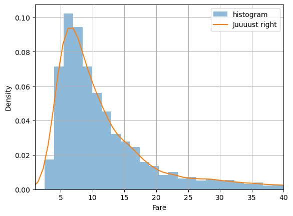
It can be useful to compare with a histogram to make sure you’re getting it right:
plt.hist(df.fare, bins=100, label='histogram', density=True, alpha=0.5)
sns.kdeplot(data=df, x='fare', bw_method=0.1, label='Juuuust right')
plt.xlabel('Fare')
plt.xlim(1,40)
plt.grid()
plt.legend()
<matplotlib.legend.Legend at 0x14913a1cba60>
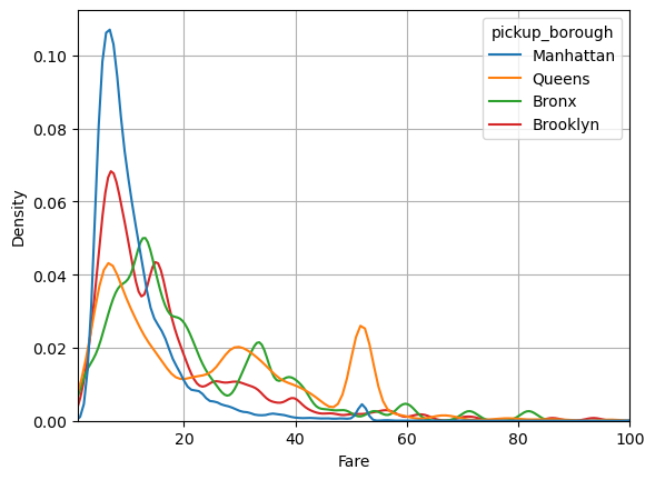
Seaborn makes it easy to group our data:
df.passengers = df.passengers.astype(str)
sns.kdeplot(data=df, x='fare', hue='pickup_borough', bw_method=0.1, common_norm=False)
plt.xlabel('Fare')
plt.xlim(1,100)
plt.grid()
Kernel Density Estimation in 2D#
Kernel Density Estimation is especially useful in 2D.
Let’s return to the iris dataset and take, for instance, the distribution of petal_length and sepal_length
df = sns.load_dataset('iris')
sns.scatterplot(data=df, x='sepal_width', y='sepal_length')
<AxesSubplot:xlabel='sepal_width', ylabel='sepal_length'>
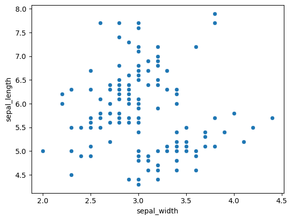
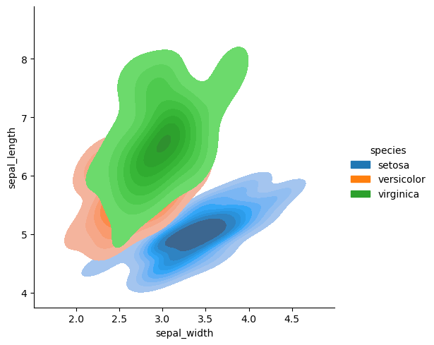
It looks like there are two groupings in the data. We can use KDE in two dimensions to visualize the distribution more clearly.
sns.displot(df, x='sepal_width', y='sepal_length', kind='kde')
<seaborn.axisgrid.FacetGrid at 0x149139f2b040>
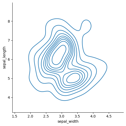
The data looks bi-modal. That is, there are two peaks. What could explain these two peaks?
sns.displot(df, x='sepal_width', y='sepal_length', hue='species', kind='kde')
<seaborn.axisgrid.FacetGrid at 0x149139cf4970>
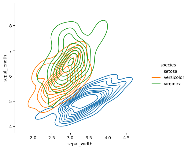
Now we can clearly see where the two peaks are coming from.
There are many ways to style the kde plots.
sns.displot(data=df, x='sepal_width', y='sepal_length', hue='species', fill=True, kind='kde')
<seaborn.axisgrid.FacetGrid at 0x14913a1cbd60>
sns.displot(data=df, x='sepal_width', y='sepal_length', hue='species')
<seaborn.axisgrid.FacetGrid at 0x14913a0d5070>
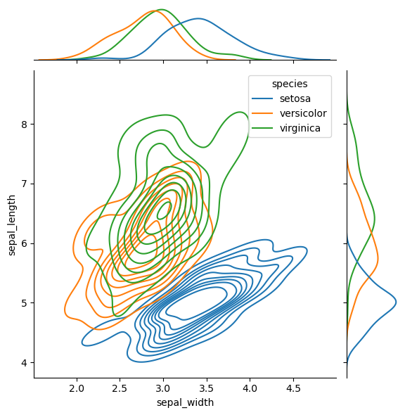
Sometimes it’s useful to see the marginal distributions
sns.jointplot(
    data=df,
    x='sepal_width', y='sepal_length', hue='species',
    kind="kde"
)
<seaborn.axisgrid.JointGrid at 0x14913d9614c0>
Interactive plotting with Plotly#
So far we have seen static visualizations made with matplotlib and seaborn. Though you can create interactive plots with these tools, it is a lot of work.
Plotly is designed to be interactive out of the box.
# import the plotly express library
import plotly.express as px

px.scatter(df, x='sepal_width', y='sepal_length', color='species', height=500, width=700)
Plotly has many impressive features. For instance, we can easily add groups and margin plots:
px.scatter(df, x='sepal_width', y='sepal_length', color='species', height=500, width=700, marginal_x='box', marginal_y='box')
px.scatter(data_frame=df, x='sepal_length', y='sepal_width', facet_row='species', height=500, width=700)
We can modify the information available in the tooltip:
px.scatter(data_frame=df, x='sepal_length', y='sepal_width', facet_row='species', height=500, width=700,
          hover_data = ['petal_length', 'petal_width'])
We can even make density plots right in Plotly
px.density_contour(df, x="sepal_width", y="sepal_length", color='species', height=500, width=700)
Animations#
Plotly makes it very easy to create animations
df = px.data.gapminder()
fig = px.scatter(df, x="gdpPercap", y="lifeExp", animation_frame="year", animation_group="country",
           size="pop", color="continent", hover_name="country", facet_col="continent",
           log_x=True, size_max=45, range_x=[100,100000], range_y=[25,90])
fig.show()
Saving interactive plots#
One of the great features of plotly is that you can save interactive features and run them in the browser.
To demonstrate we will save the above interactive plot. Try opening the resulting html file in your browser.
fig.write_html("animated_fig.html")